


PROJECT NAME
Clorox Rebranding
PROJECT CATEGORY
Branding, Packaging
PROJECT DESCRIPTION
Clorox sees itself as a leader in the household cleaning industry, yet that paradigm is not reflected through it’s logo, packaging and materials. They go to great lengths to educate customers on good hygiene by providing a wealth of facts and advice online, but the brand fails to support the company’s vision. The heavily slanted logotype in an industrial diamond and the use of bold graphics intends to communicate strength and power, yet its execution causes the brand to feel out-of-date and irrelevant to a new generation of customers.
This project is nominated Finalist for 2016 Spark Award: Fall Concept
CLOROX? CLOROX!
Clorox is a familiar and common brand of cleaning products that can be found in most households. Indeed, it is well-loved for being economical, yet effective, convenient and powerful. However, despite being a household brand, there is a lack of warmth and user-friendliness in the brand's appeal to its consumers.
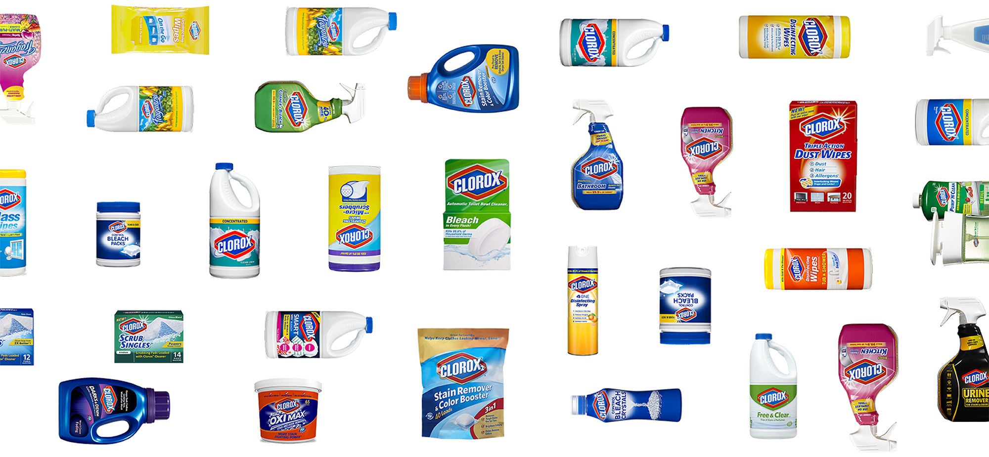
Problems of CLOROX
Bad Reading Hierarchy
It is a question that how many people actually read the instruction manual on the product packaging. Most of the clorox packagings has a similar look and bad hierarchy on read. It forces the buyers to read to understand what the product is for. Not only the font size is small to read but also a lot of the context has repeating information.

No Human Element
The chemical based cleaning substance sanitise germs and bacteria. However people gets the feeling of getting sanitised with the germs together. It’s strong and toxic scent makes people not want to breathe while cleaning.
Strong Presence
Some of the clorox products are daily use. It always need to be in the range of people’s reach. However the strong colour combination of packaging graphics makes the clorox products stand out in the environment. People tends to hide the product due to this reason.
Introducing New CLOROX
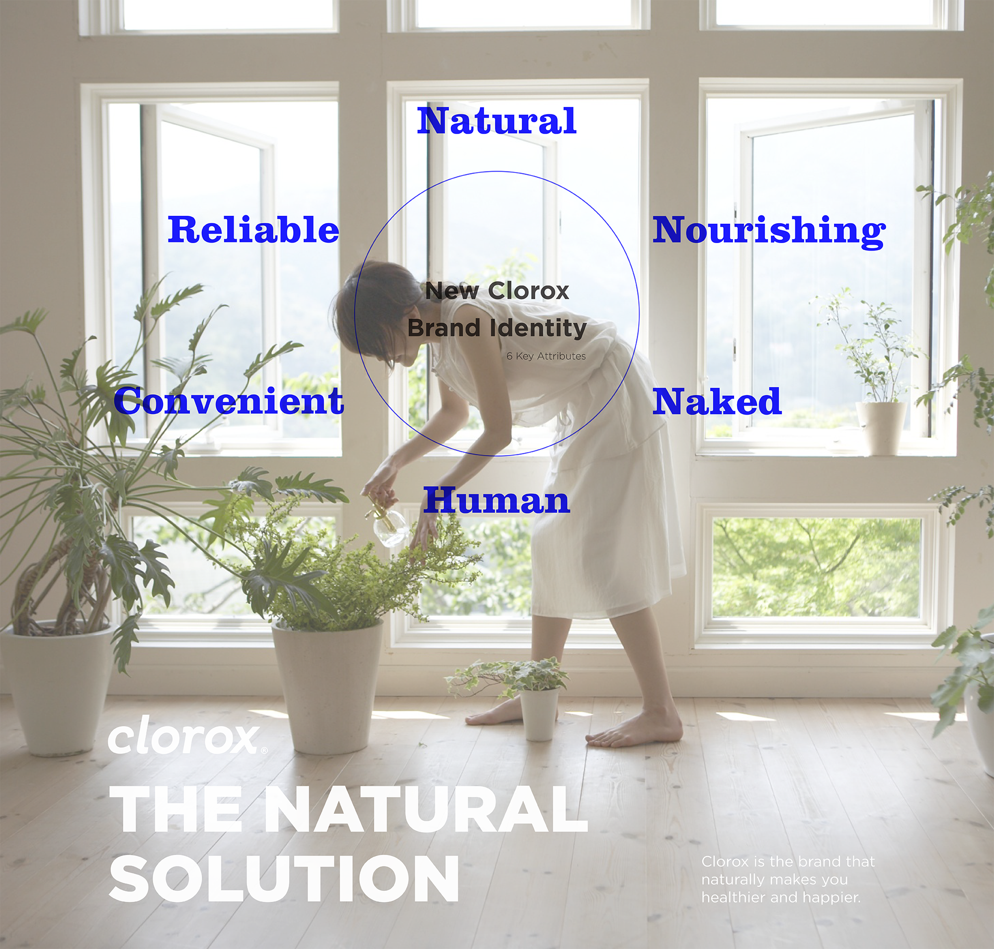
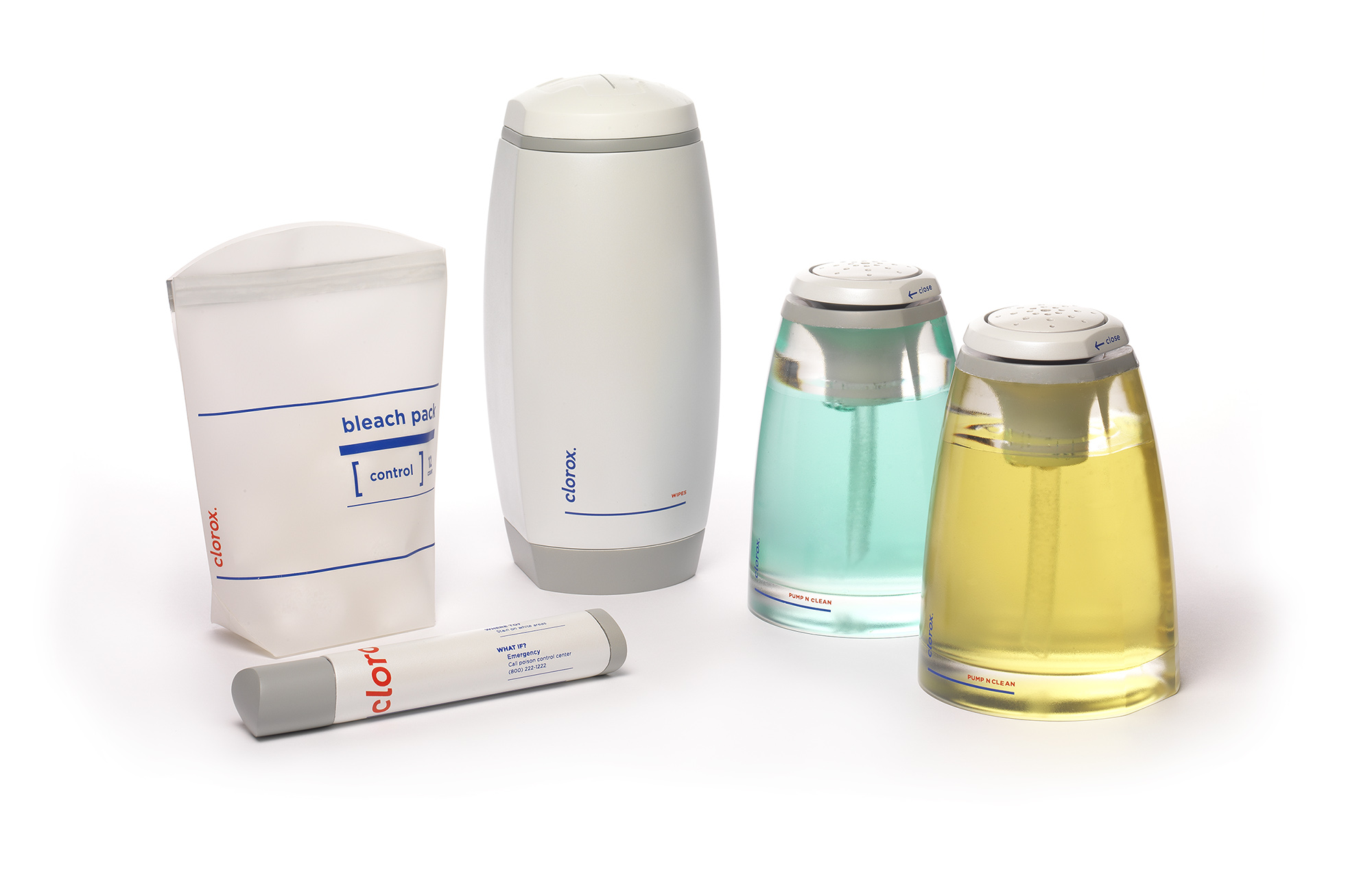
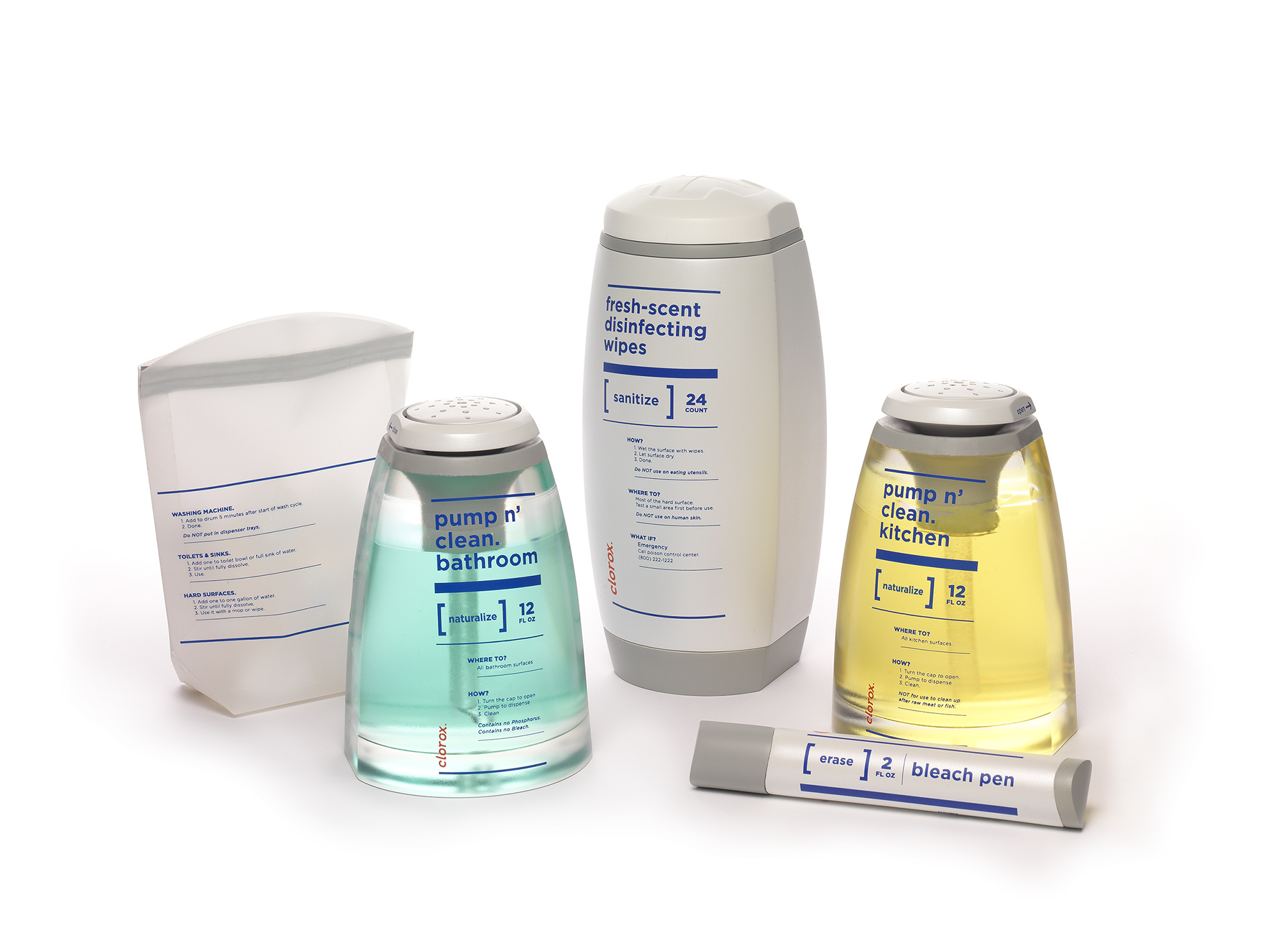
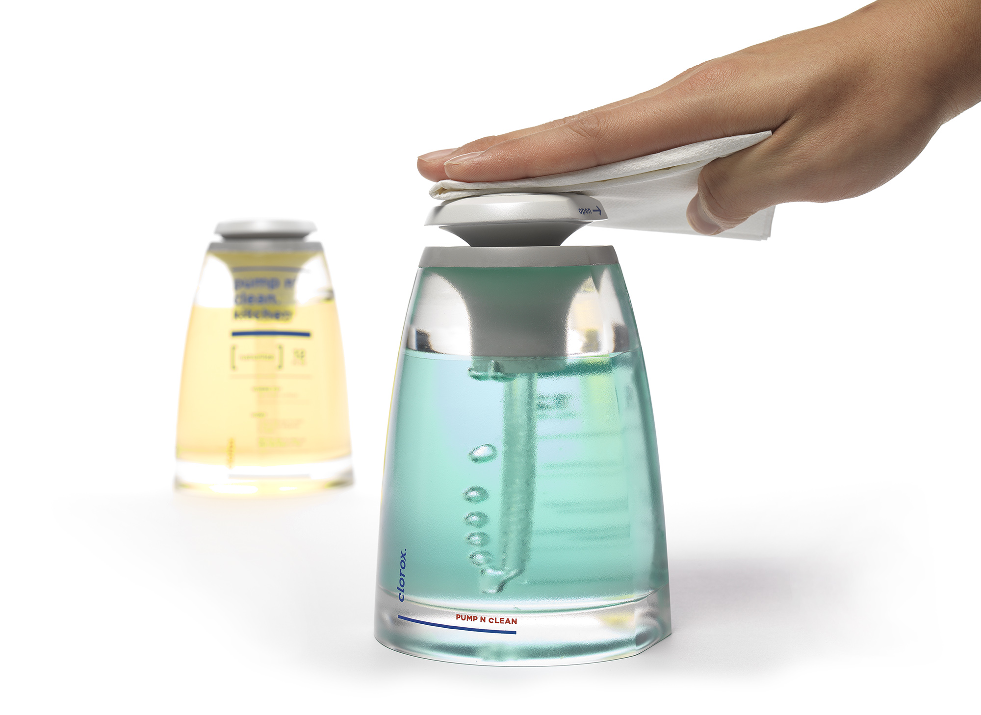
New CLOROX
Brand Attributes
Introducing the new brand of Clorox with a fresh new packaging design. The new brand identity presents a new logo and slogan, "Clorox. The Natural Solution" introduces a new brand identity which conveys the characteristics of being natural, nourishing, naked, reliable, convenient, and human.
Packaging Attributes
This is a contrast to the previous Clorox packaging, whose image was rigid, print was illegible and shape was industrial. The new design eliminates such cold elements from the packaging and, instead, introduces warmth and user-friendliness to the brand appeal.